In my opinion this is the best logo I’ve made. It still amazes me that I could merge so many different themes and meanings into one image.
In order to sell the VolleyWall, I wanted to offer a total package with all materials needed for the construction of football pitches. The VolleyWall would become part of a total solution. The name of this company became Size 5 Venues. Freely translated: football locations.
Football is the central theme. Size 5, the international size of a football, refers to this. The number 5 is literally the center of the company name, so the idea was to create a logo based on the black pentagon of a classic football.
I had a few wishes for the logo:
- The black pentagon of a classic football
- The number 5 recognizable
- Color independent
- Design according to a set of fixed rules (not an arbitray drawing)
This resulted in the following sketches:


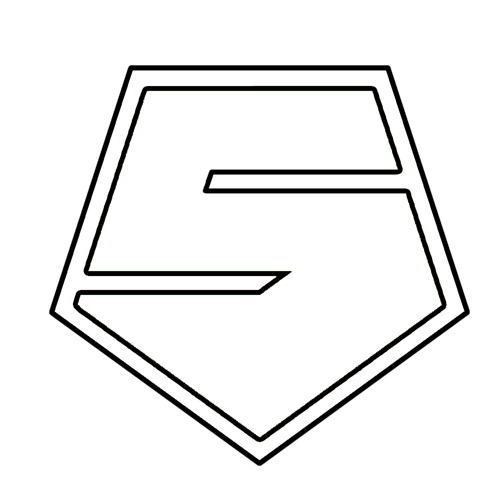

The starting point is the black pentagon. Adding two simple white lines creates the number 5. This turned out to be the basis for the further development of the logo. With the large surface executed in the contrasting color, you can see at a glance that the proportions of the number 5 are not quite right. Especially the ‘belly’ on the right is out of proportion.
Adding a frame took some of the attention away from the ‘big belly’. Through inverting the contrasting colors, the logo became less massive. However, this was not yet what I had in mind.
‘Opening’ the pentagon turned out to be the solution. This made the logo ‘airy’ and it camouflaged the big belly. A nice side effect: it creates the letters ‘e’ and ‘v’, the first letters of the surnames of the owners (Ebert and Vertonghen).
Golden ratio
The next challenge was to construate the logo according to a set of fixed rules. Because the pentagon is a well-known example when illustrating the golden ratio, I tried to use this in the design.
“In mathematics, two quantities are in the golden ratio if their ratio is the same as the ratio of their sum to the larger of the two quantities.” https://en.wikipedia.org/wiki/Golden_ratio (2022)
It is a bit too much to say that the logo is constructed according to the golden ratio. There are no line segments with the ratio within the logo. However, I did use one of the markers for the golden ratio: intersection t. At this point, the imaginary line through A and C gets divided according to the golden ratio (this also applies to the imaginary line between B and D). The thickness of the black lines is based on the distance between the horizontal lines through the intersections s and t.
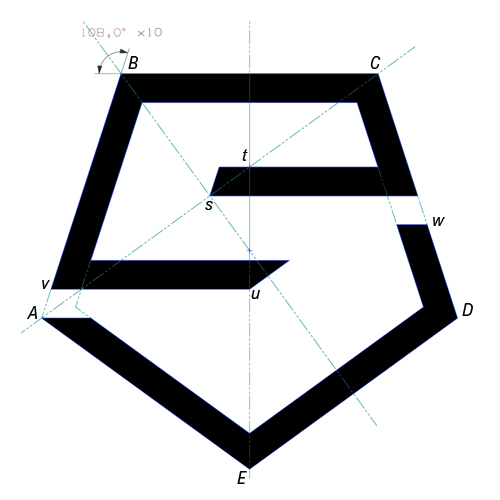
Constructing the logo
The text below might not follow the formal math rules, but it gives you an idea how to configure the logo:
- Start with pentagon ABCDE
- As auxiliary lines, draw the line through AC and the bisectors of angles B and E. This originates the intersections s and t.
- Draw a horizontal line from s to segment CD.
- Draw a horizontal line from segment CD through t, approximately unto above s. Now we have determined the thickness of the black lines (distance X).
- Draw a line from intersection s parallel to AB unto the horizontal line through t. Now we have closed the ‘starting point of the black e’.
- Draw lines parallel to CD, BC, BA, AE and ED with distance X.
- Draw a horizontal line from v to u. The horizontal distance between the imaginary line AD and the line vu equals X.
- Draw a horizontal line above vu. The distance from vu to this line equals X.
- Connect the two last constructed lines with a line through intersection u, parallel to DE.
- Draw a horizontal line from A unto the intersection with the parallel line to AE, determined in point 5.
- Draw a horizontal line from w to the intersection with the line parallel to DE, determined in point 5. The distance between the line from w and the horizontal line through s is equal to X.
- Color in the logo and remove auxiliary lines.