I find my personal logo very successful due to its symbolic meaning and versatility. It is based on the “Double Black Diamond,” which is an international symbol indicating the highest difficulty level of mountain bike trails.
![]()
Since creating the logo for my VolleyWall soccer wall, I have always tried to apply three principles:
- Color-independent design
- A shape based on a fixed rule (no arbitrary drawing)
- Multiple meanings and/or applications
In this case, I wanted to work with a symbol that represents mountain biking. You might think of trees, mountains, tire tracks, gears, or a bike. But all these shapes are difficult to combine with principle 2. Besides, nature is often not honored well by a stylized representation of reality.
The international mountain bike trail wayfinding symbol — a triangle with two circles underneath — turned out not to be a suitable starting point for adding multiple meanings. However, from my trip to Canada in 2017, I know they use symbols there to indicate different levels.
The Double Black Diamond icon is very suitable as a base for a logo. After all, the shape can be executed color-independently, the design can be created following a fixed rule, and the shape has a clear connection to mountain biking.
In the first version, I made two squares instead of the commonly used diamonds. This is because squares are less arbitrary than diamonds and thus better align with principle 2. By overlapping the squares, the logo became more compact and created the possibility to illustrate concepts such as ‘going back and forth’ and ‘focus’ (or flow) in the overlapping part:
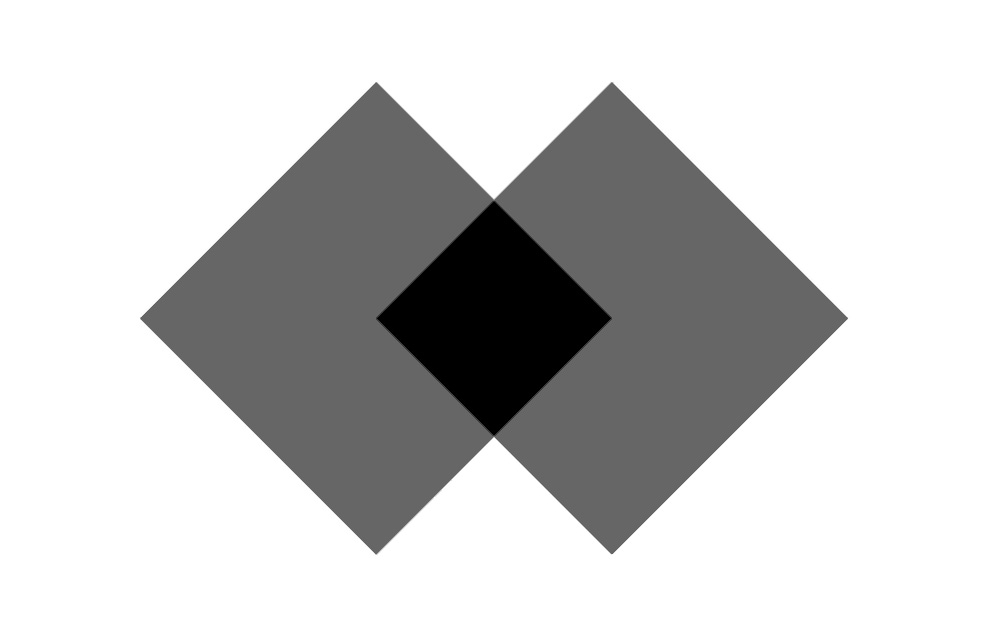
The focal point in the center most obvious if the squares are lighter than the middle, but since I wanted to work color-independently, that was not an option. By setting the shape upright, I was able to make the logo more “own.” This created an upward arrow, symbolizing progress.
As far as I’m concerned, I could have left it at that, but when I researched registered logos, I found out that this shape was already registered in a class I want to be active in. Not very surprising, but I still had to make an adjustment.
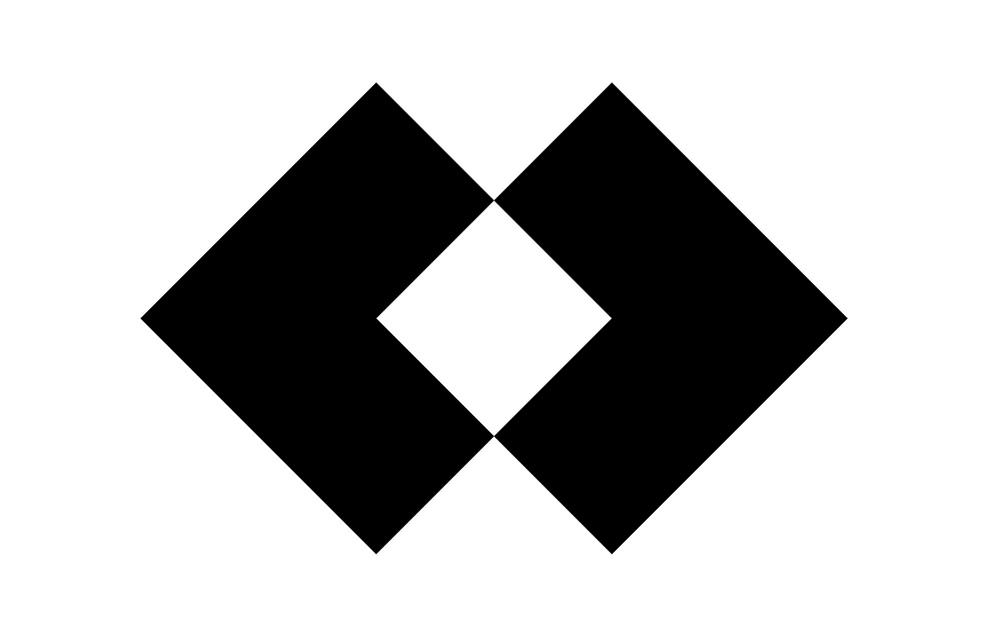
Inspired by an image of a mountain landscape reflected in a lake, I decided to add stripes to the lower half of the logo. By adding two right angles on the left and right sides, the illusion of a mountain landscape including a mountain lake was created:
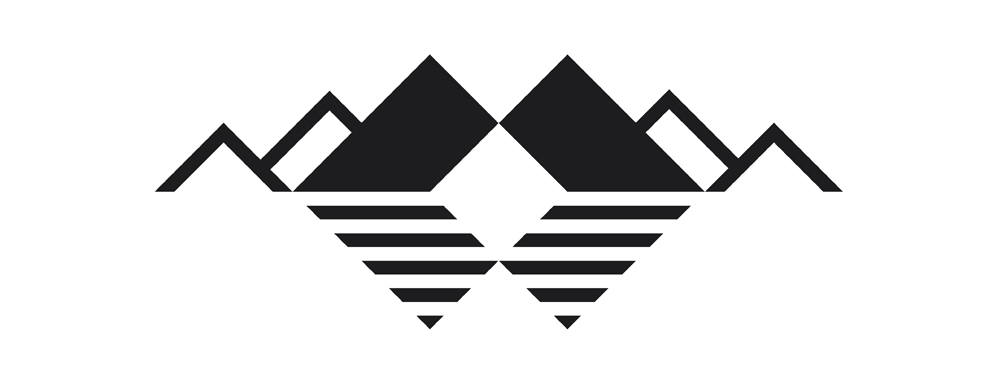
This is what I love — the possibility to use a logo in a subtle way. In this case, the logo is at the core, but at the same time, it also tells something about where you want to be as a mountain biker: in the mountains! A funny side effect is that, with some imagination, you can also see stylized tire tracks in the stripes of the upright emblem.
This is the final result:
![]()
The logo
- Has a color-independent design (although black is preferred)
- Is designed according to a fixed rule (squares)
- Is based on an international mountain bike symbol (double black diamond)
- Represents focus and flow (square in the center)
- Represents progress (upwards arrow)
- Represents nature (mountains and lake)
- Is covered with tire tracks (stripes)
- Can be applied in multiple ways
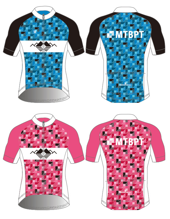
Clothing
I also applied the logo in the cycling apparel that I use for mountainbike personal training sessions. The logo is used in several ways:
- The mountain landscape has a prominent place on the shirt, but it is not an in-your-face advertisement (in my opinion).
- The emblem is the basis of the pattern on the shirt.
- The letters and emblem on the back are aligned with the pattern.